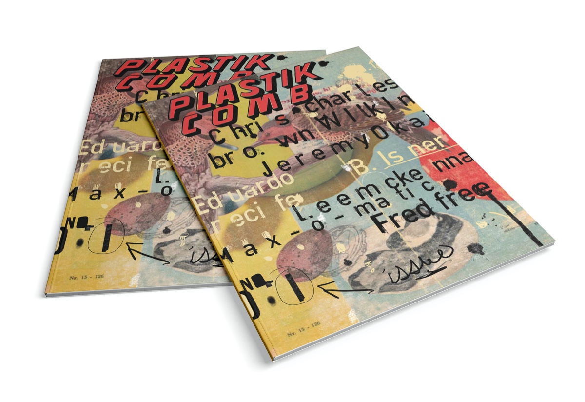
Plastikcomb Magazine (PCM)
“It’s 132 pages of spaghetti and meatballs, and when I was done I was disappointed, because I wanted more!”
Not by me, but designed WITH me, a new – printed – magazine called Plastikcomb Magazine, short PCM, of which I am especially proud.
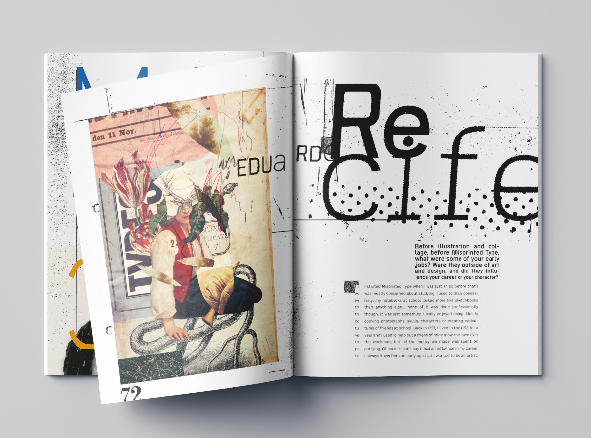
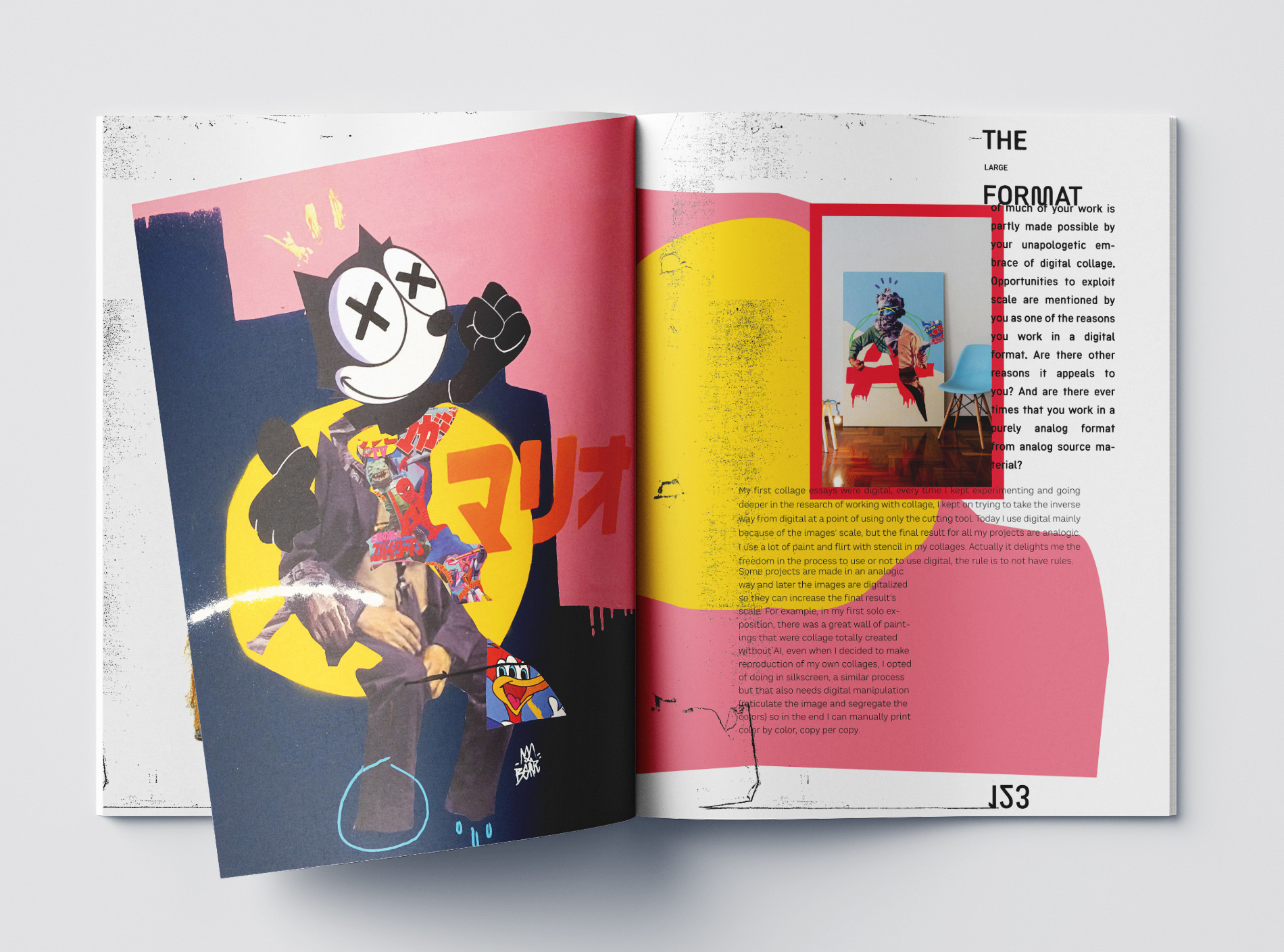
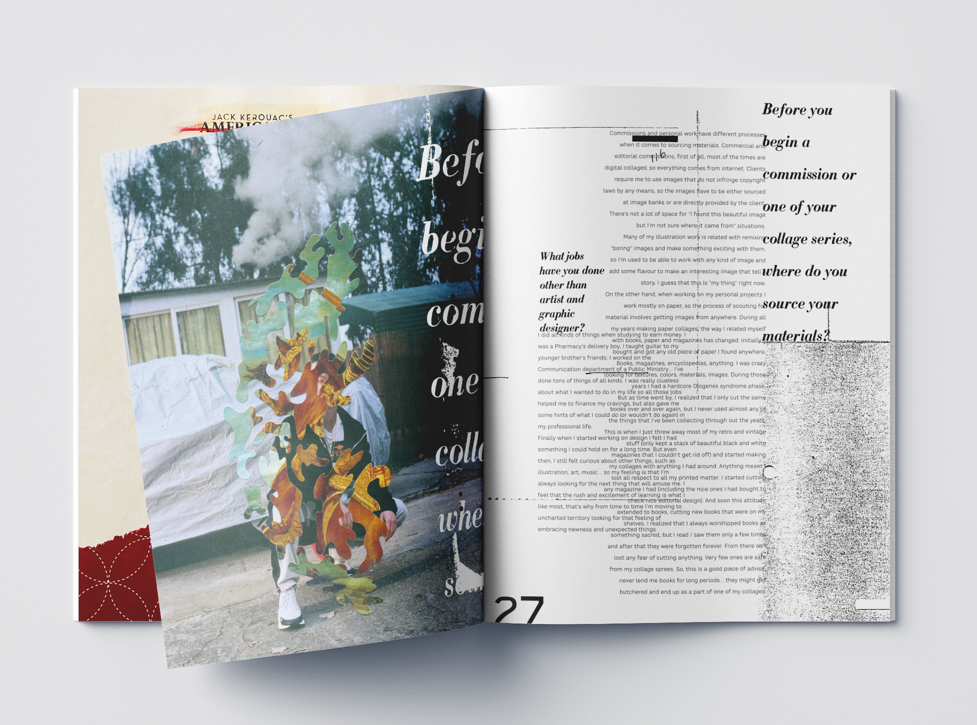
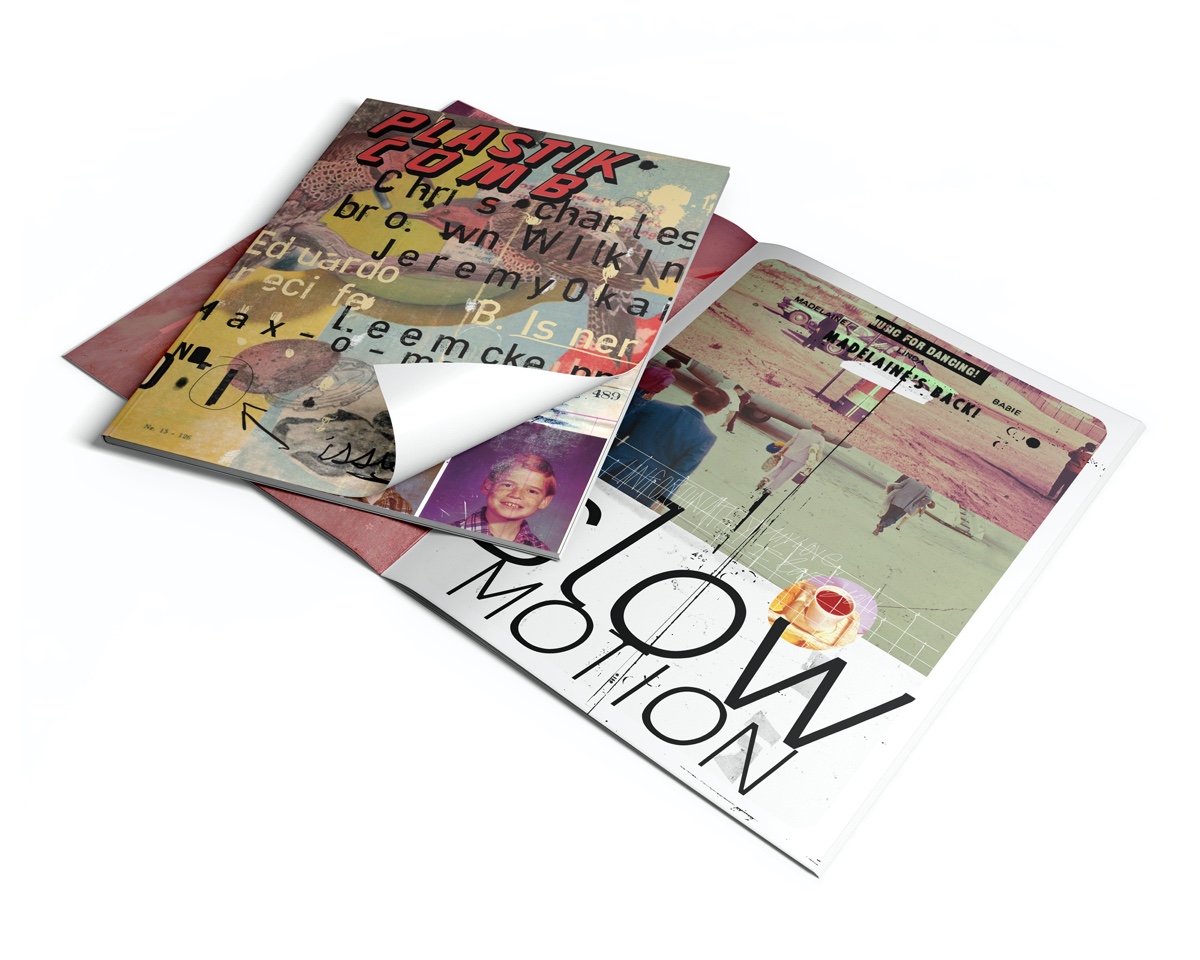
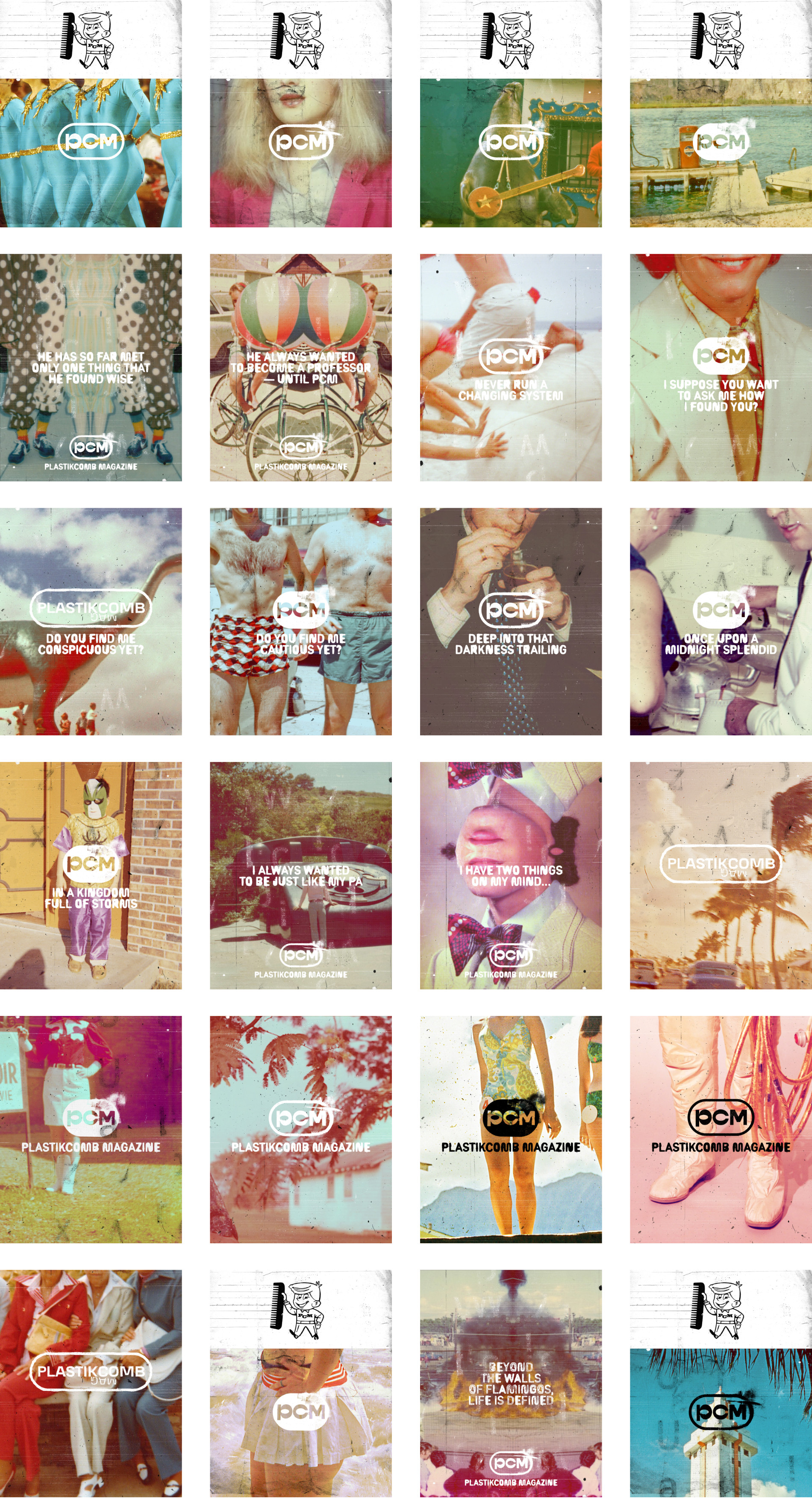
PCM is an independent magazine about contemporary art of international artists Interviews, exciting artists, a lot of art and bizarre layouts. Reminds of magazine design from the 90s, like Raygun or Speak magazine. PCM, founded by artist Aaron Beebe, offers something "new old" typographically and graphically. Aaron Beebe and {ths} had the same vision of playing off magazine design against conventional magazine layouts.
Plastikcomb Magazine could be a simple magazine with interviews, but with each issue it sees itself more as a work of art. Each layout is unique, based on the style of the presented artist. It's like biting into a bratwurst, but tastes like sweet cake. Hmmm, delicious.
Order PCM here, it is published twice a year and shipped worldwide.
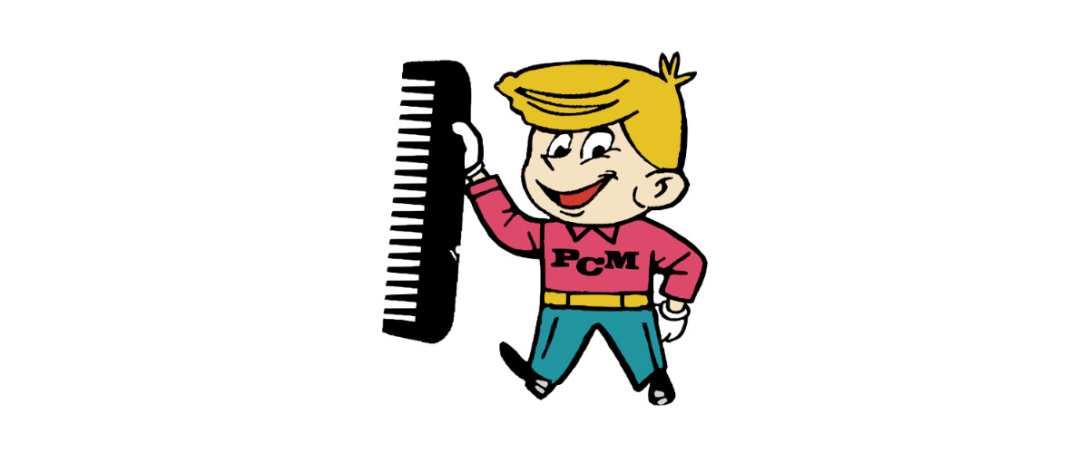
Besides the layouts, I got the job to create the PCM logo and a mascot, called “Dusty” for the magazine. On behalf of the The Cape Arcona Type Foundry we also created an unusual corporate font for the magazine and the corporate design.