Plastikcomb Magazine Issue 1
November 8, 2020
Not by me, but designed WITH me, a new - printed - magazine called Plastikcomb Magazine, short PCM, of which I am especially proud. I have invested a lot of work in PCM, created a lot of layouts and graphics and I hope to have contributed a lot to the development of the... Blah blah blah blah.
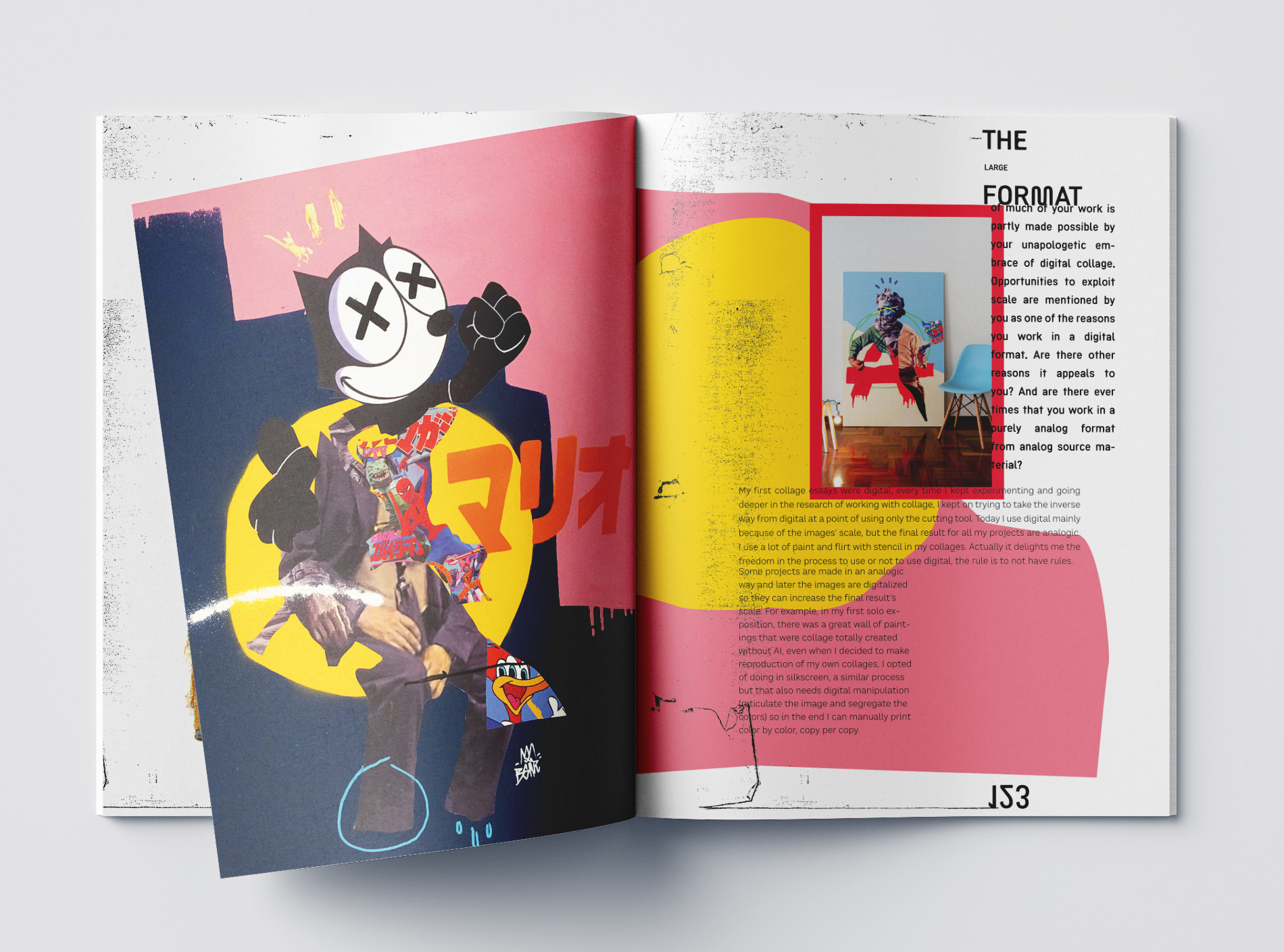
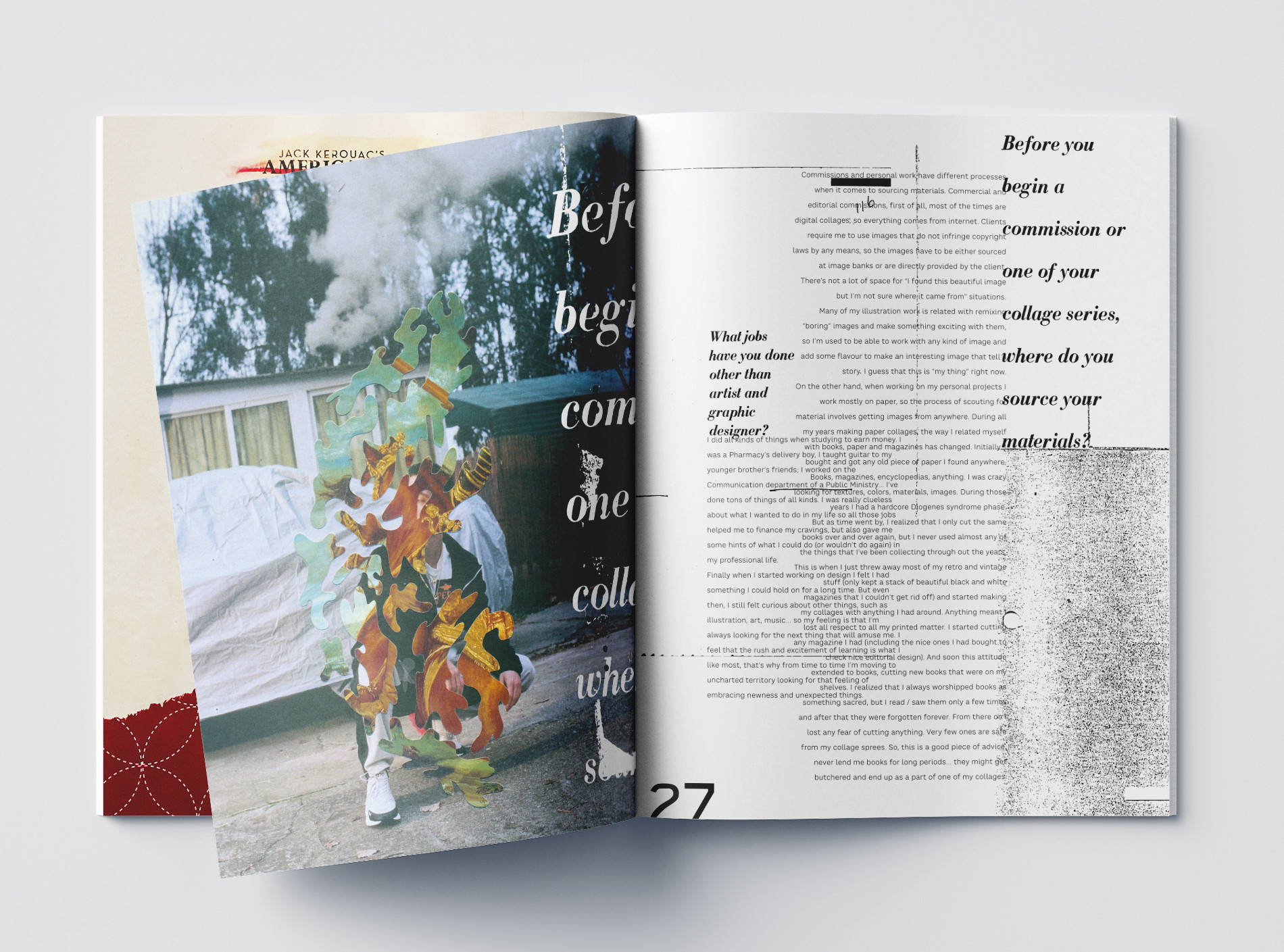
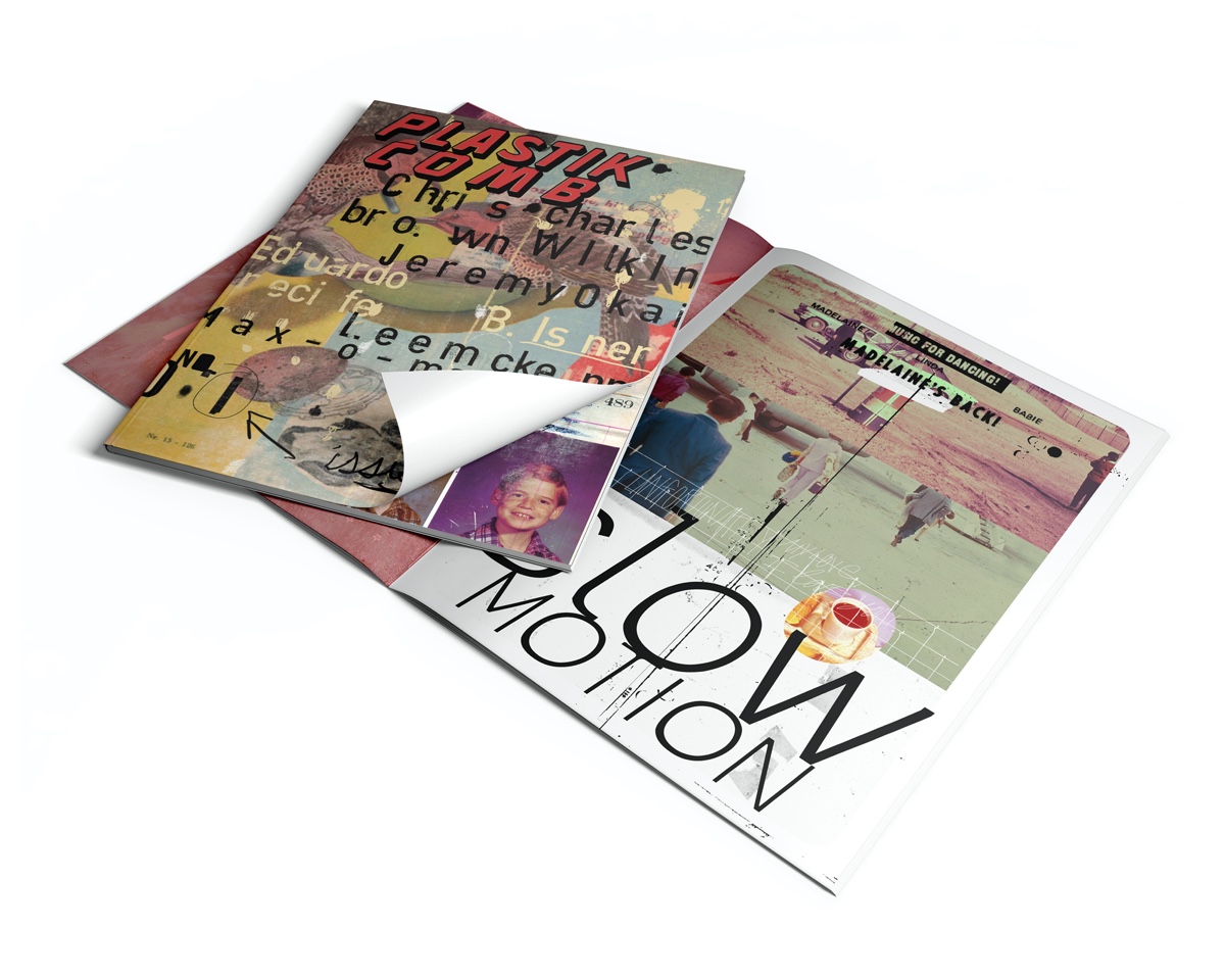
If you are interested in contemporary art of international artists, you can find a lot of things here on 130 pages without having to swipe. PCM is an independent, privately financed magazine that is not sponsored by a big, sleepy publisher. In its richness, interesting interviews with exciting artists, a lot of art and bizarre layouts, it reminds a little bit of the "good old days" of magazine design in the 90s, like Raygun or Speak magazine. Far from any fancy Berlin-bullshit-layout-efforts and typographically so completely different from the Helvetica-font-clone-armies of recent years, PCM, founded by artist Aaron Beebe, offers something "new old" typographically and graphically. It's like biting into a bratwurst, but tastes like sweet cake. Hmmm, delicious.
Aaron Beebe and {ths} had the same vision of playing off magazine design against conventional magazine layouts. The idea is that the words become one with the work of the artist. It's not just plain text on one side and the image on the other. The placement and fusion of text and image allows the reader to physically interact with the magazine, making the publication a work of art. Plastikcomb Magazine could be a simple magazine with interviews, but with each issue it sees itself more as a work of art. Each layout should and will be unique, based on the working style of the artist. We hope that we succeeded, but if not, we don't care, as long as we have fun.
You can order PCM here, it is published twice a year and is shipped worldwide.
In the words of Plastikcomb: "We are here to combat the horrible disease that plagues our planet. Plastikcomb pledges to fight Scrolleosis!"
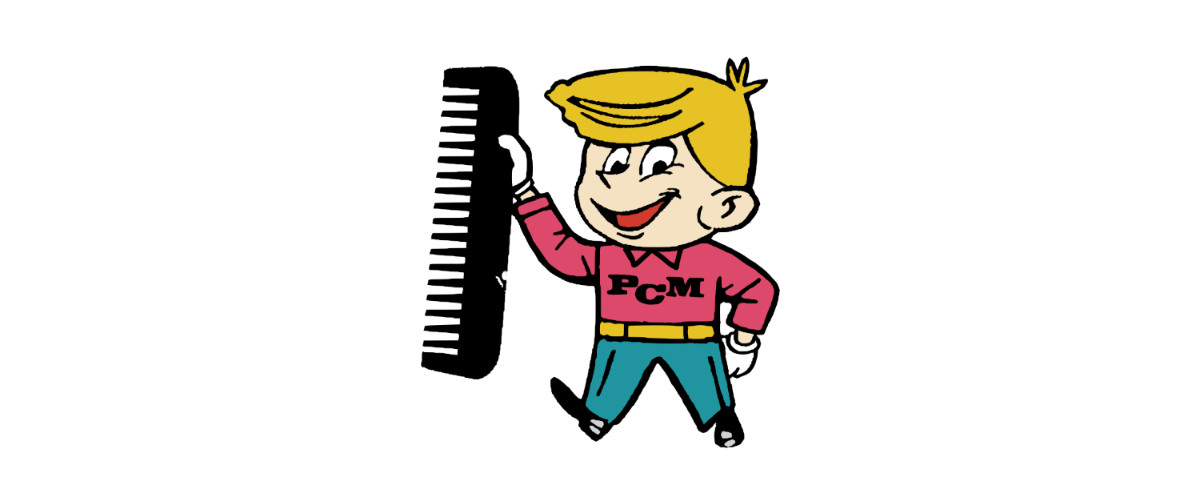
Besides the layouts, I got the job to create a logo and a mascot for the magazine. "Dusty", the PCM mascot is the result. We all love Dusty. The Cape Arcona Type Foundry and I also created an unusual corporate font for the magazine.